Marsh & Ember
marshandember.netlify.app is a fictional Charleston restaurant concept brought to life through an editorial website for menus, events, reservations, and private dining.
Food & Beverage / Hospitality
- Figma
- Next.js 16
- React 19
- TypeScript
- Sanity CMS
- CSS
- Netlify
- Vitest
- Playwright
- Axe
The making of the new Marsh & Ember website
Marsh & Ember was created as a complete restaurant concept rather than for an existing client. The brief called for a credible Charleston dining brand with a distinct point of view: seasonal ingredients, wood-fired cooking, a strong sense of place, and hospitality that feels polished without becoming formal. The central challenge was to translate that atmosphere into a useful digital experience. Visitors needed clear paths to explore menus, plan a visit, learn the restaurant’s story, discover events, reserve standard dining, or begin a private dining inquiry. At the same time, restaurant information, menus, dietary markers, events, hours, and editorial imagery needed to remain manageable through a structured CMS instead of being scattered throughout the codebase. The project also had unusually high standards for a portfolio build. It needed to work from 320px through large desktop widths, support keyboard and assistive-technology use, account for loading and failure states, avoid layout shifts, and remain honest about its fictional transactions and customer data.
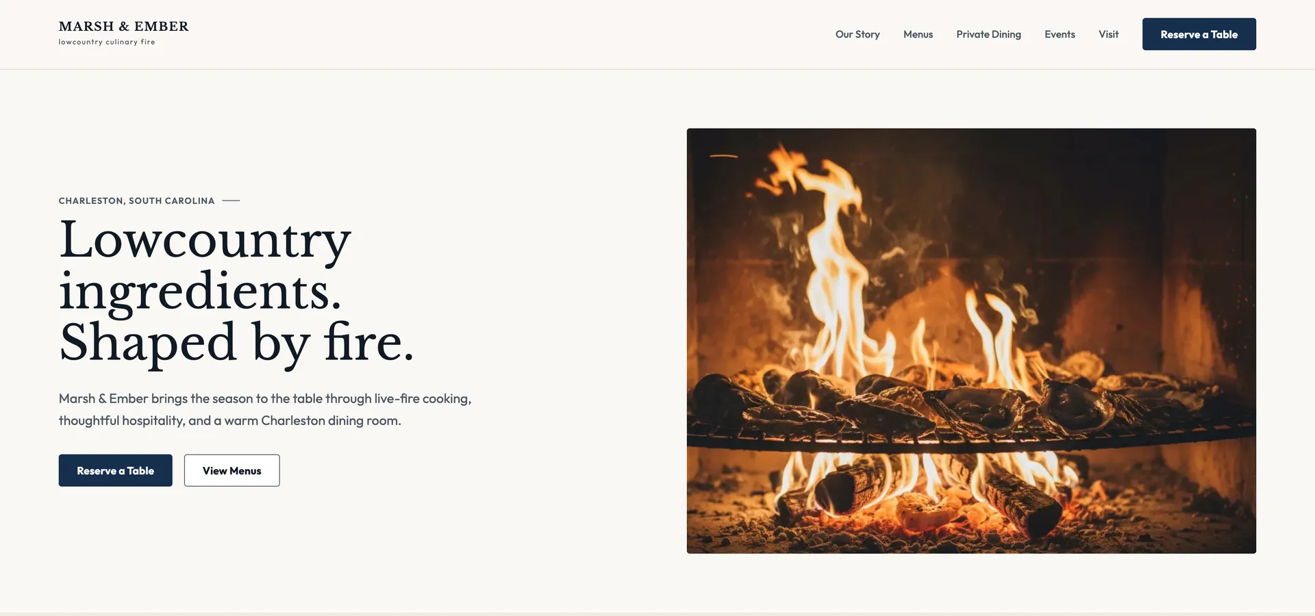
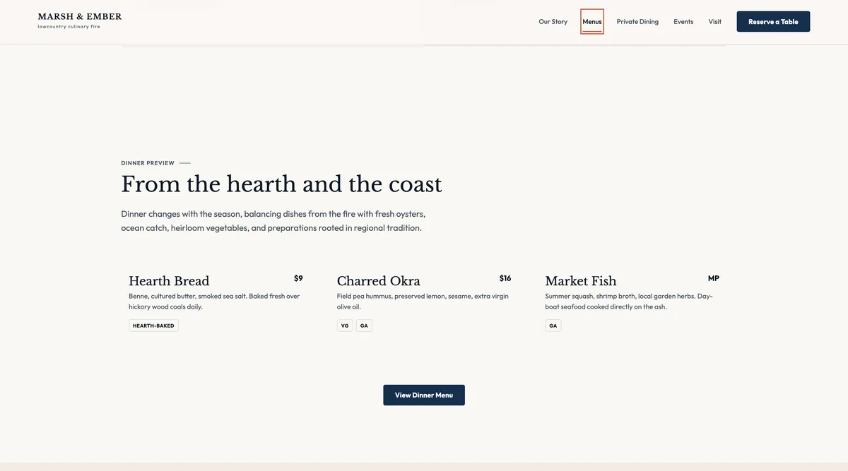
The visual direction is warm, editorial, and contemporary. Large-format hospitality photography creates an immediate sense of fire, food, and place, while generous spacing gives the content a calm, premium rhythm. Deep navy anchors the interface; warm cream and parchment surfaces soften it; restrained ember accents provide emphasis without overwhelming the imagery. Typography balances character and clarity. Libre Baskerville gives headlines an expressive, restaurant-editorial voice, while Outfit keeps navigation, supporting copy, forms, and interface controls direct and readable. Desktop compositions use intentional asymmetry and wide image crops, then resolve into a clear linear reading order on mobile. The interface was organized around a focused set of reusable patterns: global navigation, action buttons, editorial split sections, menu previews, event states, accessible form fields, status messages, and a shared footer. This allowed eight public page types and their mobile counterparts to feel related without reducing every page to the same layout.
Development
The site was built with the Next.js App Router, React, and TypeScript. Server Components handle content-led pages, while Client Components are limited to interactions such as mobile navigation, reservation dialogs, accordions, and form previews. Responsive image art direction, declared media dimensions, deferred interactive code, and reusable page sections help control performance and layout stability.
Sanity powers restaurant settings, operating hours, menus, menu sections, dishes, dietary markers, events, event facts, courses, announcements, and editorial imagery. Typed GROQ queries, generated types, content mappers, fixture fallbacks, Draft Mode, and Presentation overlays create a preview-friendly workflow while keeping published content separate from drafts.
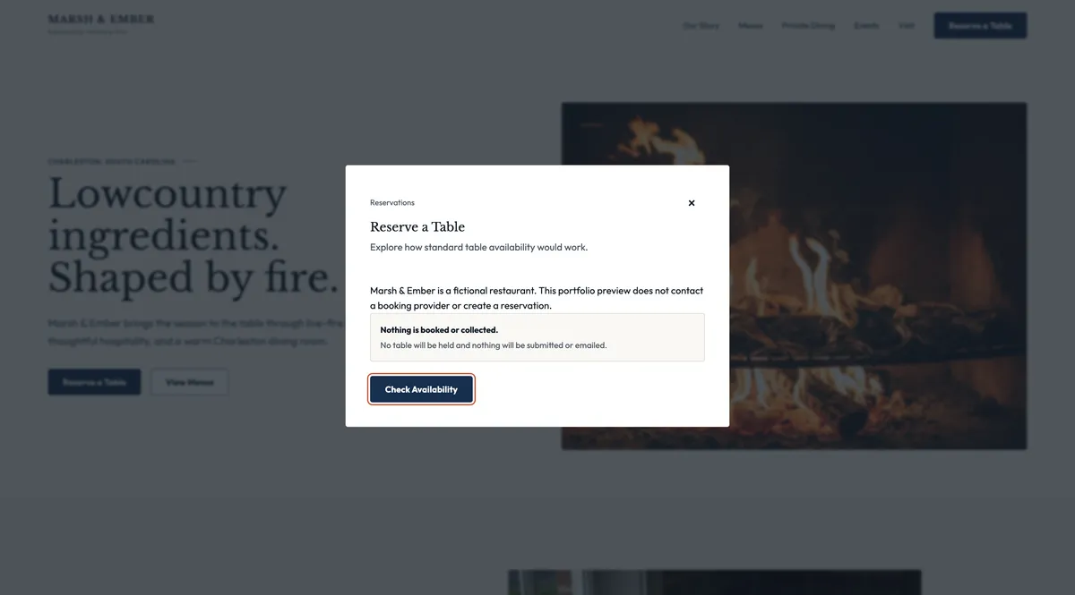
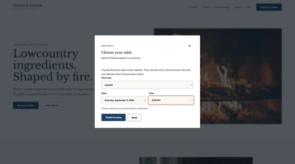
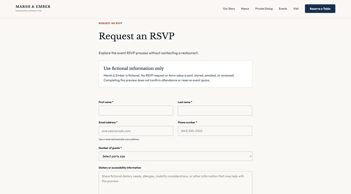
The public experience includes Home, Menus, Dinner, Visit, Our Story, Private Dining, Events, a reusable event-detail template, Privacy, and Accessibility pages. Reservation, private dining, and event RSVP experiences include meaningful validation, pending, error, completion, empty, closed, sold-out, cancelled, and past-event states. In the portfolio deployment, transactional interactions remain intentionally local and no-I/O, so no real booking, inquiry, or attendance confirmation is implied.
The approved Figma source contained 16 desktop and mobile high-fidelity page frames plus eight production-state boards. Shared code components captured repeated behavior and visual rules without reproducing unnecessary Figma wrapper layers, while route-specific compositions preserved the intended editorial hierarchy.
The desktop designs rely on asymmetry, generous negative space, and art-directed crops. Fluid breakpoints, mobile-specific image sources, controlled page gutters, and content-driven stacking preserved that character at tablet and mobile widths without horizontal overflow.
Mobile navigation and reservation dialogs required focus trapping, Escape behavior, scroll locking, and focus restoration. Forms use visible labels, linked validation summaries, value preservation, live status messaging, duplicate-submission protection, and language that never mistakes a request for a confirmed booking.
The connected Sanity workflow needed secure draft previews, exact CORS origins, a server-only read token, deterministic migration tooling, document validation, and typed content queries. The final setup supports visual editing while keeping unpublished content and credentials out of the public experience.
“A website shaped by the same care as the dining experience”
Marsh & Ember became a cohesive digital restaurant experience: atmospheric enough to communicate the brand, structured enough to help visitors act, and maintainable enough to support changing menus, events, hours, and shared restaurant information. Because the project is fictional, its success is not represented with invented traffic or booking figures. Instead, the outcome was measured through implementation quality. Final handoff verification covered 10 public routes across five representative viewport widths with no page-level horizontal overflow or broken images. Six key routes earned Lighthouse scores of 100 for Accessibility, Best Practices, and SEO, with zero cumulative layout shift in the recorded local audits. Automated coverage also exercised route navigation, responsive behavior, keyboard focus, forms, reservation recovery, event availability, internal links, security headers, and WCAG A/AA checks. The result demonstrates how strategy, visual storytelling, structured content, and frontend engineering can work together to create a restaurant website that feels distinctive to guests and practical for the people who manage it.